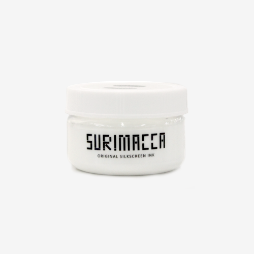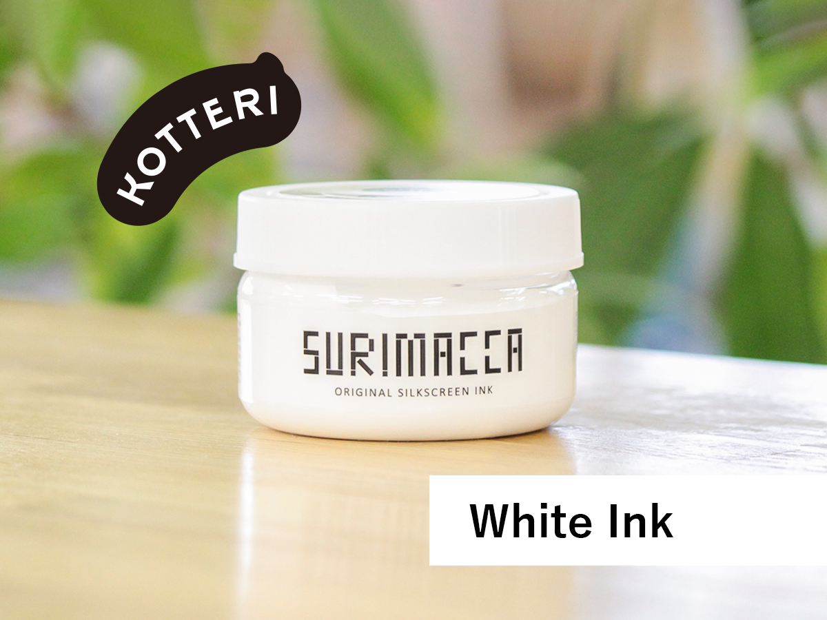
KOTTERI is a series of SURIMACCA ink that focuses on color vibrancy. It has good coverage even on dark materials.
“KOTTERI” means “high viscosity” in Japanese. As the series is called “KOTTERI,” the ink is thicker than regular inks, which gives higher vibrancy.
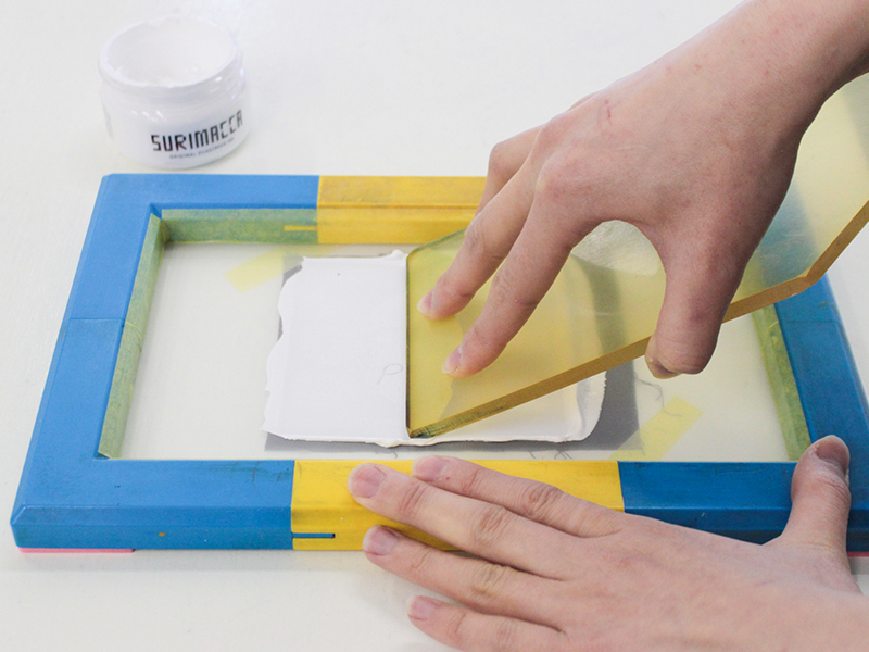
Things to be careful when choosing your mesh count
As I mentioned earlier, KOTTERI ink has higher viscosity, which is harder to pass through the mesh. When choosing your mesh count, pick coarser ones.
If you are ordering from our online store, pick 70 mesh with a cleaning, which is even easier for the ink to pass through.
Playing with KOTTERI Ink
Now let’s experiment with the good vibrancy of the KOTTERI ink.
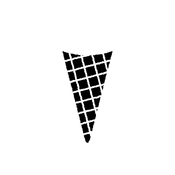
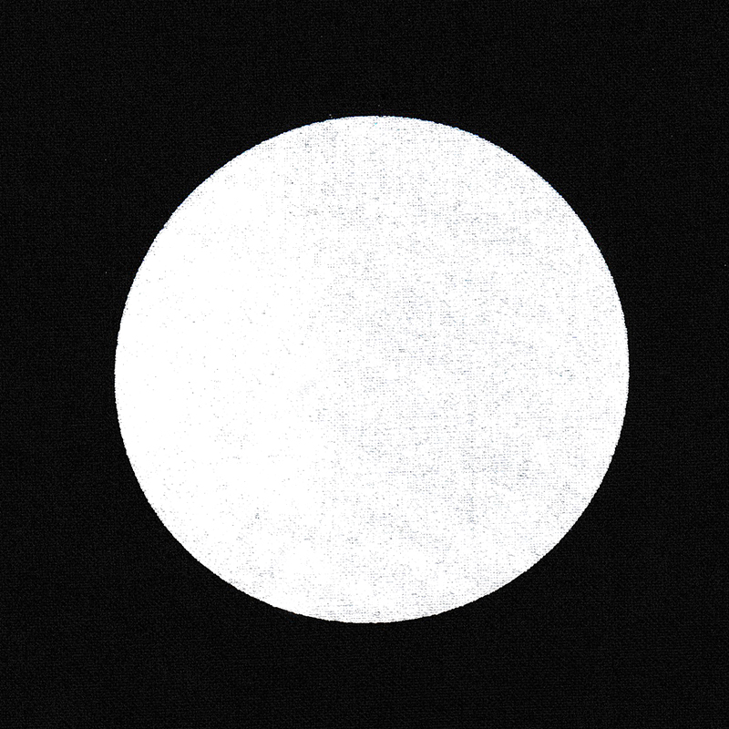
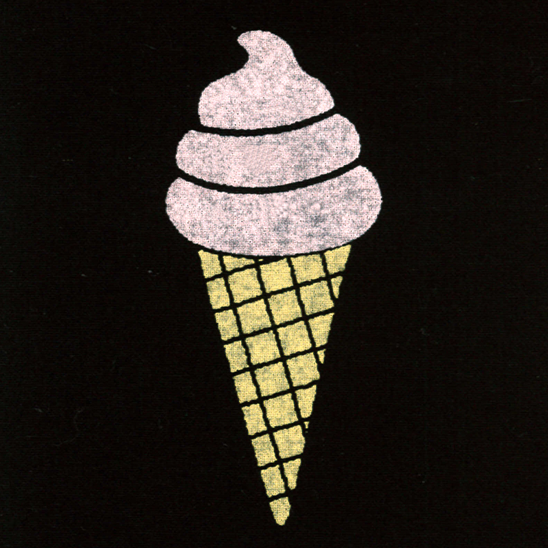
These are the artworks that I am using today. Who doesn’t like ice cream!


First, I printed them with regular SURIMACCA inks (Coral and Bread) on black and white fabrics.
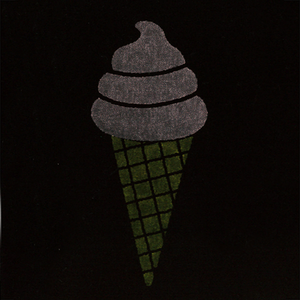
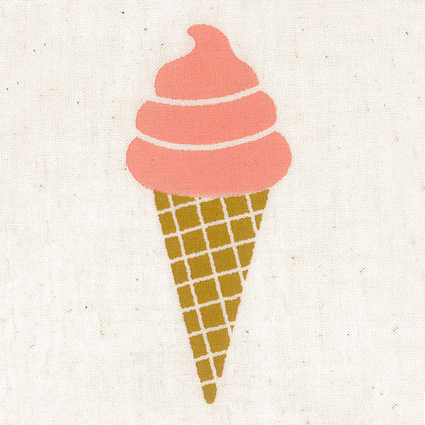
The image sinks into the fabrics and the color becomes saddle on black fabric. This is because SURIMACCA inks are water-based ink and have some transparency.
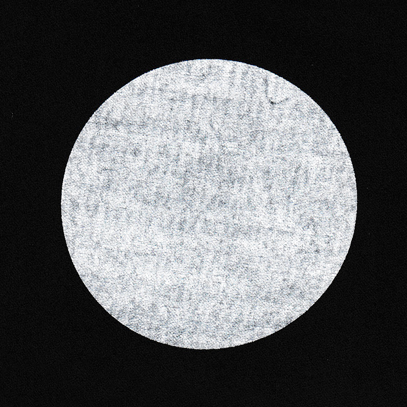
Next, I printed the same artwork with KOTTERI ink (White) and Metallic Ink (Gold).


You can see the difference at a glance! The prints are less likely to be affected by the dark material underneath.
Even compared to the one on the white fabric, the difference is not very noticeable.
Not only KOTTERI inks, but metallic inks also look very vibrant on dark materials.


Here is a side by side comparison of images printed with [White and Gold] and [Coral and Bread]. You can see KOTTERI and Metallic inks have higher coverage and vibrancy.
Tips on printing with KOTTERI ink
Since KOTTERI ink has higher viscosity, there are some tips on printing, unlike the regular inks.
Here is how it turned out without using the tips.
The print has uneven coverage and looks faint over all.
Now, let me show you the tips.
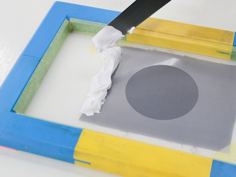
(1)Put generous amount of ink
Put more ink on the screen than you do when using regular inks.
(2)Lower the angle of the squeegee
We recommend printing with a 45-degree angle when using regular inks, but for KOTTERI inks, about a 30-degree angle often works better.
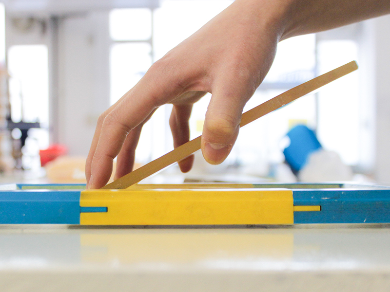
Lower-angled squeegee pushes out more ink through the screen and create higher ink coverage.
(3)Pull the squeegee twice with gentle force
Pull the squeegee twice to push out a good amount of ink to the material.
Once you finish the first pull, bring the squeegee back to where you started, while keeping the screen at the exact same place. You can add more ink when doing this.
Use the same 30-degree angle when pulling the second time.
Apply a little less force for this time. Pull gently with minimum pressure for the screen to touch the material. Imagine that you are coating the first print with more ink over it.
Here is how it turned out with using those 3 tips.

You can see that there is a good amount of ink on the material.

Here is a side by side comparison. The one printed with tips looks much more vibrant and clean!
Playing with KOTTERI ink: Extra Edition
Since KOTTERI ink has high coloration, you can utilize it in many other ways.
KOTTERI ink comes in very handy when you want to bring the coverage of regular SURIMACCA inks higher.
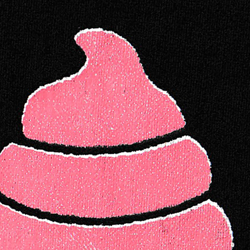
This is how the print turns out when you mix some KOTTERI ink (White) to regular inks (Coral and Bread) and print the same ice cream artwork.
Each color turns a little paler because of the use of white ink, but the vibrancy of them are much better. The more white ink you mix with, the higher the vibrancy you can get.

The comparison shows the difference very clearly here.
There is another way to achieve the high coloration using KOTTERI ink.
You first print with KOTTERI ink (White) and then print with regular SURIMACCA ink, on top of it the white ink.
Just like the images below, you can have your desired color as it is without being affected by the color of the material underneath.


The KOTTERI ink (White), that you lay down first, works as a base foundation and prevents the second color ink from sinking into the fabric, which gives you the vivid color expression.
Registration of the second layer, however, is a little hard to get it perfect.

A misaligned second layer may reveal the white print underneath (which is interesting too!), so work as neatly as possible if you would like to avoid that.
KOTTERI ink is very handy because of its versatility!